This is Part II of a two-part series on dual-screen and web design. For more context, you may want to read part Part I first.
Before we get started talking about web design on dual-screens, I want to put things into perspective using my own patent-pending Rupert’s Hierarchy of Website Needs graphic:
With that framing I think we can answer the question “Do all websites need a dual-screen mode?” Clearly the answer is: “No”. In Brad Frost-ian terms this is a “Support vs Optimization” question. Like I said in Part I of this post, Prompts is a drawing app optimized for drawing devices, so I’m happy to optimize for these new techno scribble pads, whereas your company probably has a few more other priorities before this comes up.
From a CSS perspective, it wasn’t too much effort to get Prompts in a workable place and that makes me optimistic that other app-like interfaces could do the same. But from a broader design standpoint, I can’t shake the feeling that a lot of contemporary web design is positioned against dual-screens:
- Main navigations
- Hero units
- Tightly packed grids
- Odd numbered grids
- Centered text and forms
Any treatment where a component or layout goes full-width or a page has centered content poses problems for dual-screens. That’s a lot of websites. In many ways, dual-screens literally cut against the grain of the web.
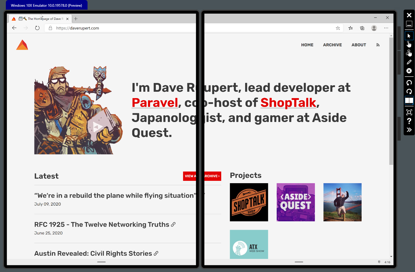
Even on my simple homepage, I intentionally made that introduction block full-width and I intentionally settled on a 7-column grid to put more emphasis on my articles than my side projects. But now both of those decisions are compromised. I’m sure I could come up with something to accommodate, but I’d have to rethink hierarchy quite a bit just to suit these devices.
Not really sure how the Surface product team is going to get over this hurdle. Most websites will probably do nothing. I suppose a saving grace for these foldable devices is that with the flick of the wrist you can escape a poor UX by tossing a website to a single screen. That’s handy, but I wonder if the lack of consistent dual-screen support creates too much friction for users and (like 3D Touch context menus on iOS) the feature loses utility because support is not just rare, but unexpected.
Ultimately, I think for responsive dual-screen support to become a priority for most organizations, more key manufacturers (Samsung, Google, etc) would need to have devices in this form-factor. Market demand probably drives the user experience here. And let’s call a spade a spade… for web designers to really care about this, Apple would have to release a dual-screen iPhone or a folding iPad.
CSS-related thoughts and dreams
Behind the scenes, supporting dual-screen web applications is really just some CSS “slight of hand”. You make your primary layout’s grid-gap match the env(fold-width) of the hinge. That single CSS trick doesn’t seem too difficult in the grand scheme of things, but will take some experimentation on how to do it well and learning what’s good, fast, and cheap in the context of your projects.
Again, Microsoft has some thoughtful guidance on how to improve dual-screen experiences which is a great starting point, but doesn’t always mean its easy to do. Take for instance the humble Modal component; Microsoft recommends not flying it up in the center. I experienced this as well, but you probably need to have a sophisticated Design System in place if you’re going to augment the behavior of every modal across the site. And often the intent of a modal is to roadblock or interrupt user progress, but is that metaphor lost when half of the screen still appears visible and operable? I guess we’ll see.
My little ~11 lines of CSS experiment spurred some thoughts about CSS that I feel are worth sharing in regards to dual-screen responsive design:
- CSS Grid is the workhorse. I couldn’t imagine re-engineering an entire, whole-site layout without CSS Grid. Upgrading your layouts to CSS Grid is —in my view— a requirement before embarking on any dual-screen experience. If you have one takeaway from all this, I hope it’s to start modernizing your layouts with Grid.
- This would be hard in utility-based CSS? Based on my experiences with utility-based CSS frameworks, I think supporting dual-screens would be difficult to achieve. Happy to be wrong because I feel like people get a lot of value out of these frameworks, but responding to dual-screens really relies on the cascade part of CSS and it seems like managing all state variations like this in HTML might get unwieldy.
- Web Components for Layout? Lord knows the world doesn’t need any more CSS grid frameworks, but I could imagine layouts are getting just complex enough that some of these common layout concerns could be distributed as Web Components, similar to iOS’ UISplitViewController, with all the responsiveness built-in.
- Container Queries would really shine here. Not to beat a
deadhorse that will take 20 years to be born, but this is another situation where Container Queries would be helpful. If I’m shifting items around on the page and styling not based on a single viewport, but rather how many viewports my elements are spanning, then using viewport-based media queries to style elements becomes even less reliable. I’m solely concerned about an element’s context inside its parent.

It’s possible that proposals like available-inline-size could assist here with component-level reflows — like flipping a full-width grid of cards back to a TableView when space gets tight, but I don’t think I’ve considered all the sorts of tricks I’d like to do here. From a typography perspective, I definitely want my type ramps to be parent-based. Like on my site, if you have an H1 that goes very large at full-width… but in a dual-screen context it only occupied half a viewport, you’d want that type size to be more appropriate for a smaller screen. This is similar to how Typetura (which is great) or my own FitText (which you should never-ever use) enable component-based type-sizing. A switch statement in CSS could maybe work here, but programming type would be more manual than the current trend of algorithmic fluid type-sizing.
Where I’m bullish on dual-screens
This was actually going to be a separate post entirely, but I think it applies, so I’m going to do a quick review of my 2019 iPad Pro. At the end of last year I finally splurged and bought an 11” iPad Pro. It has a beautiful screen, familiar apps, elegant manufacturing, and the Apple Pencil is the best stylus in the business. It’s hands down the best iPad I’ve ever owned but…
…I’m not happy with it.
Even after nine years, typing on the iPad is still terrible and not ergonomic whatsoever. The transformer keyboard cover seems like a weird compromise. The iPad is a bit heavy on the wrists and awkward to hold in either rotation and it still hurts when it falls on your face in bed. Support for the heavily advertised multitasking feature is lacking, leading to a confusing and unintuitive experience. iPad apps still tend to be an after-thought, abandonware that don’t get the attention they need sitting under the higher-priority iPhone, Android, and Web properties. Watching videos and reading are the iPad’s wheelhouse, but full screen video support in apps like News is sporadic and Picture-in-Picture support is nearly non-existent even though it’d be extremely helpful. I feel like it fails regularly at its top tasks and it all adds up to a dulling effect on my overall satisfaction with the iPad.
I realize these are petty complaints and your experience may be different, but the point I really want to make is that I don’t think the tablet form-factor is finished evolving. When thinking about what tablets could be, I always think back to Steve Jobs sitting on the couch introducing —not just the iPad but— a new vision of casual computing and I can’t help but feel that we’re drifting away from that. Devices are getting faster and have better graphics, but fundamentally the form factor and ergonomics of tablet computing aren’t any different than they were in 2011. If anything they’ve started looking like the ill-fated netbooks Steve parodied in his keynote.
That’s why I’m bullish on dual-screens because I think there’s still more levels of casual computing to unlock. It’ll be weird for a time while the dust settles, but maybe shaking up the form factor fixes some problems and eases some irritations. As an example, I was pleased to stumble upon this video talking about some of the ergonomic and productivity research behind foldable devices.
‘Hold-ability’ testing ? 🙂 pic.twitter.com/7R7mUwPAed
— WalkingCat (@h0x0d) April 25, 2020
This is why I’m happy someone is experimenting in this arena. This would be a welcome change for my RSI. Versatility and customization is an important part of ergonomics and I find myself realizing I that. It can be a book. It can be a single page. It can be one app over two screens. It could be two apps on separate screens (which I’d use the hell out of for audiobooks in Libby and note-taking in Notion). That versatility and flexibilty might mean I could stop carrying around a phone, a tablet, a laptop, and a Kindle around the house each morning because I haven’t decided what device I want to use while my kids watch cartoons. I see more possibilities and potential than I do problems with foldable devices.
Obviously this is all speculation until I get to use one of these devices. Microsoft or whoever, if you want to send me one of these little buddies, I’d gladly accept. But the one feature I’m most excited about —and the one I’d hope to use most often— is that you can close the device like a book, banish the black rectangles, and walk away.