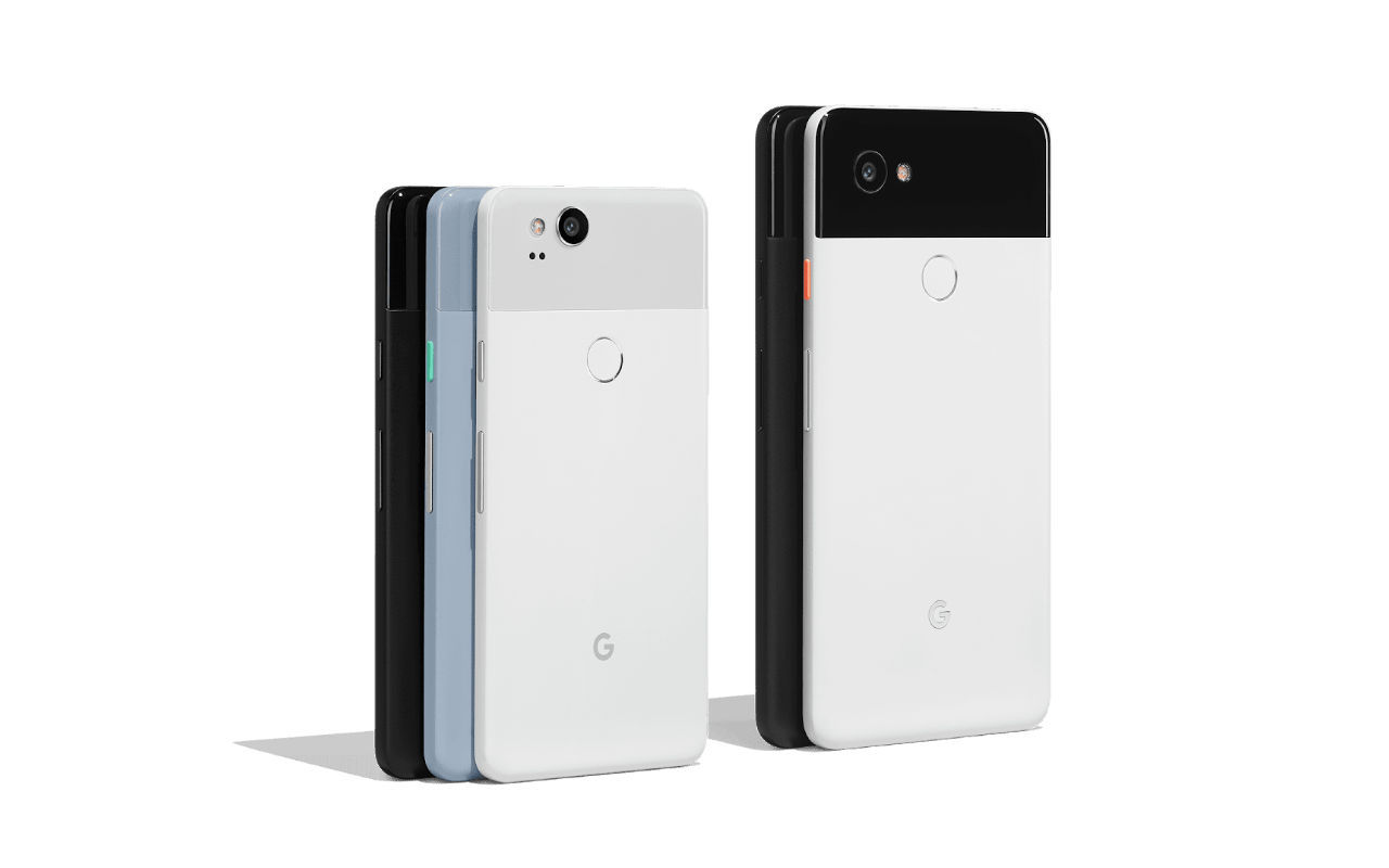
Just before Christmas the mail carrier brought me a brand new Google Pixel 2 XL. Unboxing it I was met with a beautiful Teenage Engineering-inspired device. The camera is amazing and takes beautiful bokeh portraits even in low light.
I was really excited to break away (more) from the Apple ecosystem and try something new and different. A mobile platform that really embraced the Web.
Loading up DayTrip and Global Defense, I felt the raw power of Progressive Web Apps as the Add to Homescreen heuristics invited me to install my side projects. I was thrilled and beginning to taste the rainbow-flavored future of the Web.
But I returned the phone after five days… here’s why…
Material Design Dystopia

Let me start by saying this: I think Material Design solves a big problem for a company like Google. Bringing brand consistency to a myriad of platforms and products is no small task.
As I waded through the Material Design landscape I found myself getting more disoriented than delighted by Material Design. I think my issues were less about the design system choices and more with the cohesive implementation.
- Type changes froms screen-to-screen and was disorienting. Droid Sans, Roboto, Noto, Noto Condensed. Bold, light, semi-bold. There was no consistency from screen-to-screen within Android, let alone app-to-app.
- App-Header changing colors on each app was okay, but it often went overboard and changed from screen-to-screen within a single app. The default Messages app would change app-header colors per conversation. Trent was purple. My wife was dark blue. It made no sense. Is this a synesthesia thing where you assign colors to your conversations? I didn’t get it, it felt gaudy and disorienting almost as if the app was confused about itself.
- Chrome’s meta theme color configurable with the
<meta name="theme">tag is a cool browser feature but again confusing. Browsing sites would change the app-header like plugging in a new strand of Christmas lights. I felt out of control. And when a site chose#000000as its theme-color, I thought I was in a Private Tab.
There were a lot of other microaggressions but the type and app-headers –a core part of any design system– were a broken experience. Those core elements should feel the most stable, the most timeless, but instead felt cacophonous. And FWIW, my day job is implementing design systems and finding inconsistencies, so perhaps I’m more sensitive than most people.
Daydream Disappointments

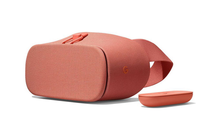
Google’s Daydream VR is cool. I was looking forward to this enough to get the $99 Daydream View headset with the Pixel 2. But after a few test drives, I again found myself more disappointed than delighted.

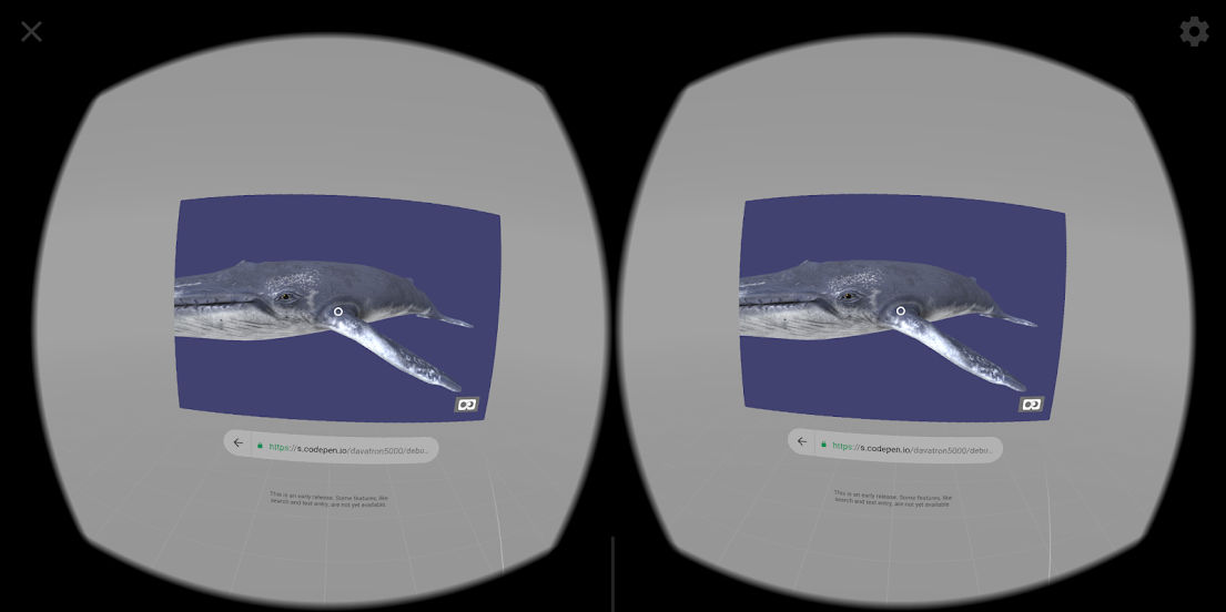
- Non-immersive WebVR in Chrome was a surprise. The Pixel’s high-density display was beautfiul, but when rotated to fit into the Cardboard it didn’t go edge-to-edge. And there was very clearly more pixels my phone could use. FWIW, this might have been a bug in the User Agent sniffer that A-Frame relies on.
- WebVR in the Daydream View was even worse because you don’t get the immersive experience, you get a floating pane with a website on it. This is disappointing.
I am very pro-“Casual VR”, and I thought Daydream + WebVR would be perfect for me, but the interop there didn’t meet my expectations. I don’t think my expectations were super high, just that Daydream would work like its little brother, the Cardboard, but the Chrome in Daydream experience behaves differently. My dreams of a mobile VR browser in a comfortable headset were dashed.
Cat & Mouse Privacy
Okay, Tin Foil Hat Time.
I went to the park with my kids. Probably pulled out my phone to check Twitter. Whatever. Got home and was asked to rate the park I just visited.
No, sir. Nope. I don’t need a phone tracking me and my kids. Then asking me to seed their product database with reviews.
So I disabled 1 of 41 different notifications for Google Maps. However, as I soon learned, disabling the notification is not the same as disabling the location tracking. Hours later, the Google Search app started telling me about places I was near while driving around.
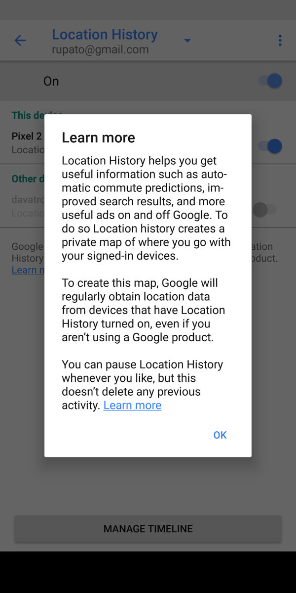
Ugh. Eventually, deep within Settings I found a screen called “Location History”. On this page was a link. It was a link to a map of every location I had been to in the previous day!


Yeah. Fuck this. That’s creepy. Technically I opted into this feature because Google Maps asked “Google Maps would like to know your location, YES or NO?” Of course my answer was “YES” because, hey, it’s a fucking map. I didn’t realize I consented to having my information and location history stored indefinitely on Google’s servers.
I began all the work of disabling this “feature” but it seemed like a fruitless task. Also worth noting, Google Maps for iOS keeps Location History as well.
People and tech blogs rave about the settings, configurability, and notifications on Android and while it’s great, it’s also so much. I felt like I was auto-opted into 400 mailing lists.
I don’t need a Real Time Strategy Game for my Privacy with my phone’s OS. I don’t need to be constantly notified to improve Google’s data-driven products. I don’t need a phone begging me to use its AI Assistant. I need a phone that disappears and connects me to the world.
Configuration Hell
Lots of Twitter feedback was “You should install a custom launcher and configure it!” A “Launcher” is basically an app that replaces your homescreen with a custom homescreen and icons, they can even change fonts and colors in the operating system. Yes, I thought. I’ll try that. Maybe this will cure my Material Design woes.
But as I evaluated launchers and began the process of customizing the look/feel/colors of my Phone’s OS, I decided that’s not what I want in life. I configure websites and build tools for a living, I don’t want to do that with my phone. It’s possible I’m getting old, but I don’t have the time or patience to redesign my phone’s User Interface via a third-party tool.
Experiment Over
So my experiment ended. Badly, I’d say. I probably won’t ever purchase another Google product for my daily driver because of that notification to rate my local park. I appreciate the buried transparency of the Location History screen, but seeing that map of everywhere I had been that previous day freaked me the fuck out and confirmed a lot of my apprehensions about switching over to an operating system powered by an advertising platform.
And sure, sure, AT&T gathers that information from cellphone tower hits. Yeah. Sure. But this… this felt different. Google doesn’t actually NEED to know this info. Google simply wants it. And takes it.
A third option?
After returning my phone I went back to my iPhone but after expending my entire battery in the morning, I went out and rage-bought a new iPhone. This was on the same day it was revealed Apple was throttling CPUs on older devices. This is the first time I’ve bought an iPhone and not been happy to have a new device.
Why can’t I have a phone without giving up my privacy? Why can’t I have a phone that doesn’t intentionally throttle my CPU? Why can’t I have a phone that embraces the Open Web over their proprietary, 30%-cut-off-the-top native app ecosystem?
I wish our society was more tolerant of third contenders. It’s always iOS or Android, Coke or Pepsi, Republicans or Democrats. I wish there was a third option… and I don’t mean Blackberry or Nokia Windows Phones. I mean like a really viable third option with decent hardware, great privacy, and support for Progressive Web Apps.
Only having two options doesn’t feel like choice. It feels like compromise. Fingers crossed the future is more diverse.