Here’s how it all started. I’ve been tinkering with a little Slack bot recently and wanted to deploy it on BeepBoop. BeepBoop requires a Dockerfile to deploy. “Okay,” I said, “I don’t really use Docker, but why not.” I set about trying to install Docker for Windows.
Docker for Windows looks like it should work. If you search for it, there are tons of blog posts from higher ups at Microsoft saying “Windows will run Docker”. Wow. This sounds so easy and wonderful.
When you install Docker it tries to install a few things: Docker CLI, docker-machine (for creating VMs), docker-compose, Kitematic (a GUI), Docker QuickStart, and Oracle VM VirtualBox. On Windows, however, you can’t run native Hyper-V virtualization concurrently with VirutalBox, so you have to disable Hyper-V and restart your computer.
This is when trouble started happening. After I had everything installed, my computer would get stuck in a Blue Screen Of Death loop. Docker and VirtualBox would try to set virtual network adaptors and my WiFi card drivers would collapse, TCP/IP quit working, and Windows would fall over. I wasted a day and a half trying to get this problem fixed to no avail.
To fix my machine I uninstalled Docker. But the bot deployment TODO was still lurking, so I opened up my dusty Macbook Pro…
Back to Mac
It took 20 minutes to install Docker and run it successfully. Twenty. Minutes.
This reaffirms the #davegoeswindows lesson I learned with Rails; the Web is universal, but our tools are not. “Just spin up a Docker” is great advice if you’re on a Mac, since it’s a trivial task. Some people, it is told, have had no issues with Docker on Windows. I am not one of them.
It goes without saying that completing a task instantly compared to wasting a day makes you question some recent life and technology decisions. As I pondered, my thoughts (again) led me to the theme of software quality and also recognizing how much Apple has relentlessly pursued and iterated on Performance and User Experience.
What’s good about OS X?
When I opened up my Macbook I hadn’t charged it in weeks or months, but instantly the screen came on and there was still 54% battery. I couldn’t help but contrast this to my Surface which takes an embarassing 30+ seconds to awake from sleep and seems to only have a half day hour battery life even shutdown.
A lot of WebPerf principles correlate here: If content is available immediately, users are happier becuase they are closer to finishing their task. Response times need to be in milliseconds. Similarly, if you conserve battery life, the device lasts longer and makes users happier.
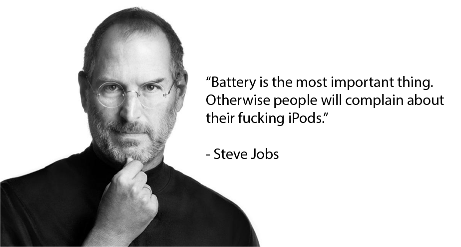
A lot of credit to Apple here as they figured this out years ago and are militant about it. Probably due endless feedback about their successful line of laptops and iPods. Performance seems top-of-mind for Apple, so much so I imagine there must be posters of Steve Jobs talking about battery life all over 1 Inifinite Loop.

Adding to an incredible User Experience, all the apps from my previous session were still open and ready to be used, frozen in suspended animation. Contrast this to whenever I log into Windows, even after a visit to restroom, signing in takes for-ev-er, long enough that I sometimes open my phone from boredom. Returning to your Mac after weeks and it being just how you left it makes it feel like an incredibly sturdy platform, almost bulletproof.
Comparing app stability in the two operating systems, I also noticed some subtle psychology afoot in OS X. When an app on Windows crashes it’s wiped from the screen immediately. This feels like a legacy window management trick: “O god, things have gone wrong. Get it off the screen before it destroys everything in memory.” But when an app on OS X crashes, you get a playful little beach ball spinning eternally: “Don’t worry, buddy, we’re trying to fix it. If the computer thinks hard enough maybe this app won’t crash and you won’t lose your data. Hey look at that, you’ve been whisked away to the beach! Yay! Fun!”
I think a lot about apps crashing since Twitter for Windows crashes every time I use the Notifications panel. If this was an issue on the iOS client, I imagine an air raid siren would go off at Twitter HQ. But the Windows client? Meh, maybe next sprint.
I’m not sure what’s the better User Experience. Being brutally honest and clearing the memory and screen immediately? Or effectively lying and trying to let the User down slowly? I’m leaning towards the OS X approach.
So where’s that leave me?
I still like Windows. The aesthetic of Windows 10 really suits me and the software keeps getting better with every Insider Fast Track update. The Docker issues I cited might actually be fixed in a recent Docker for Windows beta which uses Hyper-V instead of VirtualBox. Adding to that, I think my issues with Docker were compounded with a particularly unstable Fast Track version of Windows with lots of separate WiFi and startup/restart issues. I hate to make a hard-formed opinions based on beta software.
However, these over-arching User Experience issues are becoming hard to ignore. Performance and how quickly I can begin using my computer is a big deal. Apps feeling “sturdy” -whatever that is- is a big deal. Switching back to Mac illuminated this and brought back a lot feelings about why I started using a Mac in the first place.
I’m interested to see where Windows is headed in its next iteration. As luck would have it, Rey Bango has invited me to come out to //build/ this week (think WWDC, but for Windows) where I’ll get a glimpse of the future of the Microsoft platform. I’m really looking forward to it, entering the nexus of the ecosystem, and I’ll to do whatever necessary to put a HoloLens on my fat head.