In my first post on contrast-color() I demo’d using color-mix() to change a background-color on hover, but I will be honest… mixing black and white isn’t always what you want. It would be cool and helpful to coerce contrast-color() to return either 1 or -1 so that we could adjust lightness in a color function on hover instead of only mixing white and black.
Building on the inline CSS if() statements in my last post, we can use the same trick to interpolate the result of contrast-color() into a number.
Disclaimer: All caveats from the previous post about browser support, caching quirks, and expected syntax changes still apply.
See the Pen contrast-color() powered design system colors by Dave Rupert (@davatron5000) on CodePen.
Ahh… feel that? Now our states maintains its harmonious color palette where mixing in white or black gets us a bit muddier results. We’re picking another note on the scale of the color’s lightness ramp.
The relevant CSS to make this trick work goes like this:
/* Needed for if() statement */
@property --captured-color {
  syntax: "<color>";
  inherits: true;
  initial-value: white;
}

/* https://lea.verou.me/blog/2024/contrast-color/ */
@function --contrast-color(--bg-color) {
  --l: clamp(0, (l / var(--l-threshold, 0.623) - 1) * -infinity, 1);
  result: oklch(from var(--bg) var(--l) 0 0);
}

button {
  background-color: var(--ds-button-bg);
	--captured-color: --contrast-color(var(--ds-button-bg));
  --lighter-or-darker: if(
    style(--captured-color: oklch(1 0 0)): 2.5; /* go extra lighter */
    else: -1; /* go darker */
  );
  ...

	&:hover, &:focus {
		background-color: oklch(
			from var(--ds-button-bg)
			calc(l + (0.1 * var(--lighter-or-darker))) c h
		);
  }
}
For comparison’s sake, I web-inspected up a little apples-to-apples, side-by-side of the adjusting lightness way and the color-mixing way of algorithmic hover states where it’s 10% lightened/darkened versus 10% mix of white/black.
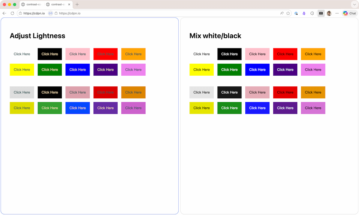
The difference is almost imperceptible, but the hover states from the “Adjust Lightness” method feel a tad bit warmer, particularly on the bottom row with the green, blue, and purple buttons. The difference becomes more obvious if the step is greater than 10%.
Unless your customers are a bunch of color dorks, they probably won’t see it the care you put into this. But I’m willing to wager that even if they don’t see the difference, they will be able to feel the difference.
We also get a lot more control with this if() statement route. For example, I can set the lighten amount to 2.5 (+25%) instead of 1 (+10%) because that’s what felt better. If you’re algorithmically generating your color palettes, it should be easy to find the ideal values; either a step-up or step-down, perhaps. And we’re also not just limited to lightness! You could mess with chroma or whatever the b in lab() is. Find what makes sense for your system.
A part of me wants to take this even further to get more control. For example, if the color is super dark (e.g. black) and the lightness value is below 0.1, lighten by 25%, otherwise lighten by 10%. That might be possible with an if() inside the oklch() or a sin() function… but that sounds like a lot of Math and probably hurts readability. More experiments to do though.
It’s fun to embark on this new world of algorithmic color schemes in vanilla CSS. While I’m excited to play, I’m more excited to see what your beautiful brains come up with.