As President of Web Components, it’s my duty to publicly comment on every Web Component library and framework that exists. Today I’m taking a look at Quiet UI, a new source-available web component library soft-launched by Cory LaViska, the creator of Shoelace WebAwesome. You might be asking “another UI library? But why?” and that’s a good question, I’ll let Cory tell you in his own words…
I wanted to play with bleeding edge features that weren’t available in all browsers yet… I wanted to take everything I learned from developing components over the years and challenge some ideas, try new things, and bake in opinions that I’ve traditionally veered away from. It felt liberating.
“Play” as a foundation is compelling to me. A lot of writing and ancient programming advice says “Write the thing, then throw it away and write it again” and while that sounds like an incredible waste of time, your second draft understands the problem set better than the first and you can make smarter/different decisions. And as Cory points out, the last half-decade has been a heyday for Web APIs and browser interop, which means your components can be more robust with less code. Whether you use web components or not, it’s a good time to re-evaluate your component system and do some quality-of-life upgrades.
Peeking at what’s inside the box of what Quiet UI has to offer, I’ve found some interesting concepts beyond the industry standard set of components. Let’s take a look…
Theming system
A design token theming system is pretty standard fare for a component system. Out of the box you get a generous set of harmonious static color primitives all based on color-mix() to generate a consistent palette.
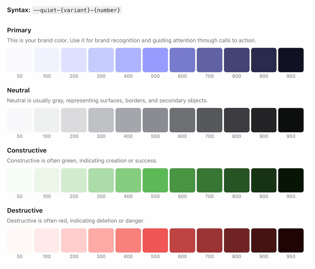
With the static primitives, you get a set of “Adaptive Colors” for text, fill, and stroke colors. Rather than a numeric ramp, this ramp is a 5-stop vibrancy/loudness scale and each color ramp adapts to light and dark modes.
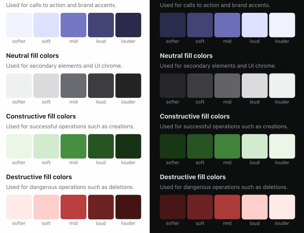
It’s tempting to have an 11-step color ramp and then think your adaptive color ramp needs to also be 11-steps, but based on personal experience that leads to more contrast problems than it’s worth, so limiting the adaptive light/dark colors to 5-steps and the border and text ramps to 3-steps is a good idea. I applaud the restraint that went into that decision.
It’s a minor thing aspect, but naming the color collections “primary”, “neutral”, “destructive”, and “constructive” are nice, semantic –yet generic– buckets for values. It wouldn’t be too difficult to add one or two more collections for extra spice.
Restyle native elements
Quiet’s “Restyle” stylesheet has a lot of appeal to me. It’s a cross between a CSS Reset and a default stylesheet to theme native elements to look like your design system components.
I could see this as a nice offering so consumers of your design system can use regular ol’ HTML alongside the first-party components and it’ll all maintain the same look and feel because they’re using the same underlying token architecture.
Adding to the base theme and restyle, you also get some global CSS utilities to glue everything together.
Useful utilities
The CSS utilities are nice but Quiet UI goes a bit further and offers a handful of helpful JavaScript utilities in the form of web component wrappers.
<quiet-include>- HTML includes are a bit of a passion project for me, so this is nice to see.<quiet-infinite-scroller>- No one wants to code their own virtual list, what a great addition.<quiet-transition-group>- Animations based on the Web Animations API. And if those animations aren’t good enough, you can check out Quiet UI’s Scurry library.- Also included are elements for Intersection, Mutation, and Resize Observers.
Now, I’m the kind of idiot who wants to learn how to handwrite observers, then not use them for awhile and forget how they work, then have to re-learn observer patterns from scratch every two years… but I could see how others would not want to do that.
Abstracting away some of the more painful learning curves through a thin, declarative web component wrapper API seems like a smart decision.
Components and gimmicks galore!
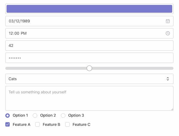
Inside Quiet UI is an impressive number of components for a side project. There’s all the standard UI components like Accordion, Breadcrumbs, Cards, Dialog, etc. The documentation breaks off Form controls into its own little section, which makes sense because form-associated custom elements are a bit unique in webcomponents-land.
But what I want to call special attention to is what I will lovingly refer to as “Gimmick Components”. A gimmick sounds bad, like a cheap trick, but I mean it in the “Aww, that’s cool, they didn’t have to do that, but that’s cool” sort of way. Quiet UI bundles tons of little non-everyday, nice-to-have components into the kit. As you start digging through the LEGO bin, the mental image of what you could build starts growing…
- Browser Frame - A one-off to frame screenshots or make a section feel more web-like.
- Comparison - Don’t always need a responsive image compare tool, but I know I don’t want to build my own.
- Expander - Truncation happens… and it’s nice to have a good option right out of the box.
- Flip Card - Few know how to master this CSS-trickery.
- Joystick - A design system with a joystick? Novel.
- QR Code - It’s Friday and the marketing team needs a website by Monday.
- Slide Activator - Slide to activate! In a website!
- Sparkline - A matter of time before someone asks for a baby chart.
- Random Content - Spicy Lorem Ipsum!
- Timed Content - The holiday campaign goes live when you’re asleep and must end when you’re unwrapping presents with your family. And there’s a code freeze.
- Zoomable Frame - Browse infinite canvases with ease.
And there’s a whole collection of smaller components dedicated to text formatting.
- Bytes - This isn’t hard to do, but I’d rather have a component and call it done.
- Countdown - 8 out of 10 cats recommend this plugin. Check it out before the timer reaches zero.
- Fit Text - Feel like I’ve heard about this somewhere…
- Number - I had an
Intl.NumberFormatissue the other day, would have been nice not to have that issue. - Number Ticker - Bosses love number go up!
- Relative Time - Again,
Intl.RelativeTimeFormat… not the funnest one to get sucked into. - Text Mask - An old effect, but a goodie.
- Typewriter - Taka-taka-taka-tak. Look like your favorite generative AI chat bots.
Like I said, there’s a lot of gimmicks inside of here. A lot of these are already available (or could be) as “Standalone” components, but bundled in with a consistent styling API makes it all that much nicer.
I browse a lot of design systems everyday and they’re all the same boring collection of 20-30 components with different levels of Bootstrap / Material / Tailwind / ShadCN flavoring mixed in. These types of random, not-solely utilitarian components elevate Quiet UI above the pack.
The gimmicks create an atmosphere of “Play” that’s part of Quiet UI’s foundation. It culminates into a feeling of “fun” instead of business, business, business. It ticks a box in my brain that if my UI needs some pizzazz or something a little unconventional like a countdown timer or a number ticker on a random Tuesday in November… Quiet UI might be a good base to build on. I’m seriously considering making this the default component set for all side projects going forward.
Quiet UI? Oh, that’s the fun one.