In Chromium 139, CSS gets a new corner-shape property which unlocks some cool new CSS tricks. Most notably it gives us “squircles”, the mathematical superellipse shape introduced by Apple in iOS 7. Designers have been in love with them ever since and include them in every design comp using Figma’s “corner-smoothing” slider even tho CSS has no similar correlation… until now!
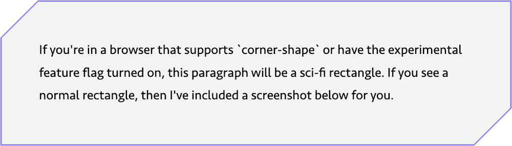
Frontend Masters has a beautiful writeup on corner-shape and superellipses showing that it goes way beyond squircles to make some real complex shapes. One capability they didn’t cover in that post is probably the most important of all: CSS corner-shape enables easy sci-fi rectangles.
By “sci-fi rectangles” I am of course referring to the sci-fi film and television trope where all rectangles (doors, windows, furniture, user-interfaces) have one to three angular corners instead of all corners being the old, boring, un-futuristic 90º rectangle corners. They are the cooler version of rectangles by all accounts.
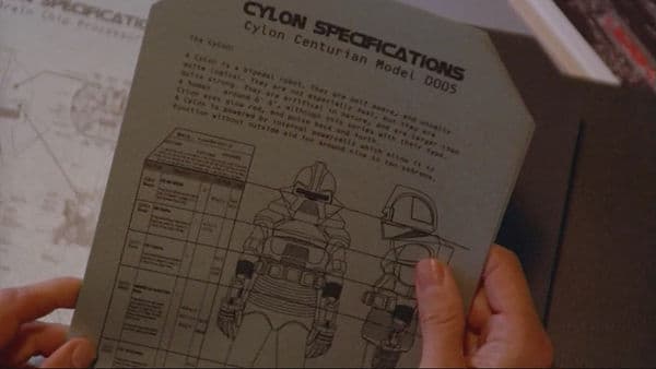
Even the physical paper documents in Battlestar Galactica were sci-fi rectangles, how frakking cool is that!?
There were ways to image-mask or clip-path yourself into a sci-fi rectangle with CSS, but those have some downsides and mathematical complexities. It couldn’t be easier with corner-shape, in fact it’s a two-liner:
.sci-fi {
	border-start-end-radius: 50px;
	corner-shape: bevel;
}
My favorite version is probably when there’s two opposing corners notched out:
.even-more-sci-fi {
	border-start-start-radius: 50px;
	border-end-end-radius: 50px;
	corner-shape: bevel;
}
As demonstrated above corner-shape is a wonderful progressive enhancement. A browser doesn’t support squircles? They get rounded corners and the brand doesn’t fall over. You can also put corner-shapes in @supports (corner-shape: bevel) for even more graceful degradation. That’s what I did because a rounded corner is totes un-sci-fi, so I only enable the corner-shape if supported. Because corner-shape is not an image-mask or a clip-path, they’re automatically responsive and squeeze without any percentage-based tomfoolery. They’re animatable too! You can transition them on hover or focus if you want. The full power of CSS, baby!
One quirk I’ve discovered while playing with corner-shape is that the default browser :focus-visible outline won’t hug the corner-shape unless you re-define a custom :focus-visible outline style. That strikes me as weird, so I made a little reduced test case of this quirk you can debug and tell me what obvious tidbit I missed.
Wrapping this up, I’m excited about corner-shape because it has real world implications. A product I work adjacent to is currently shipping 215kb of squircle clip-path masks in production right now. Yikes. That’s a lot for fancy rectangles. corner-shape will be a sizable web performance improvement for their users and reduce maintenance burdens over time. Wins all around.
So remember, kids: Friends don’t let friends ship 200+ KB of squircles in production. Talk to your friends about progressively enhanceable CSS features today!