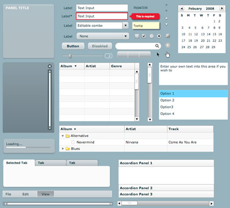
One day my friend Bryan told me to come look at something on his computer. I respected Bryan, he was a bit older, and his opinions always weighed heavily on me. This seemed urgent, so I shuffled in his office as quick as I could.
On the screen was a grey’ish looking website. Bryan made websites. I made websites. We had that in common. And playing guitar. He looked me in the eyes and said “This is Flex. It’s the future of websites and you need to learn it.” And from what he was showing me, I was impressed and astounded. A fully rich internet application. XML-powered tables and lists with sorting and animations that you’d spend months building in Flash. I had never seen anything this professional before.

Flex was the successor to Flash. Or a better way to put it, Flex was Flash but for applications. It came stock with an entire UI kit (aka design system) with form inputs, textareas, form validation patterns, buttons, tabs, accordions, tree browsers, scrollbars, loading bars, and even a calendar. A UI kit in a box. Everything you needed for serious enterprise-grade business applications.
And when I mean applications, I mean applications. Flex worked with Adobe AIR, so you could install your Flex app on people’s computers in a distributable “native” application. The one true write once, run anywhere framework.
The demo-of-all-demos for Flex had to be the drill-down pie chart on the budgeting app Mint. I would spend hours zooming in my categorized spending to get breakdowns by subcategory and back out. Smooth buttery transitions and animations without a single page load. Mint got acquired by Intuit, so Flex appears to be a kingmaker. YouTube wouldn’t exist without Flash either. Flash and Flex were so popular, Microsoft wrote a competing rich internet application development framework called Silverlight.
Flex had meta-frameworks too to help people build Flex sites even faster. They embraced the super popular MVC pattern. Frameworks make sites better because developers can work faster and that trickles down to the user. Flex and Flash tooling is superior, so you’re able to make experiences you could never dream of making in an HTML5 website.
That’s Flex. It’s built for real applications, not websites. It has a thriving ecosystem. Backed by a big company like Adobe. Regular updates. It’s built on Flash and used by the majority of serious web developers. It’s great, no problems.
Okay. I’ll admit making Flash sites accessible is notoriously difficult. And SEO for Flash sites is also difficult. But beyond that, perfect.
Okay, okay. If you want to be a little more critical… one problem with Flex applications is that they don’t work well on phones. They only worked on one phone to be exact; the Motorola Droid. My brother had one of those phones. He could play tower defense Flash games on it. He made a lot more Flash websites than I did (I got into custom faux-Rails PHP sites), so it made sense why he liked the non-censored version of the web.
Steve Jobs didn’t have to write a mean blog post about Flash. A lot of people make a living doing Flash sites, so that’s pretty rude of him. Who cares if Flash was extremely impractical for phones because it shredded the battery and had a bunch of security holes. Flash was popular and people liked it and people got paid to make Flash and Flex sites, ergo, it’s good. But it didn’t matter if Steve didn’t like Flash because the majority of my users were on desktop.
Over the years I tried again and again to pick up Flex. I had okay ActionScript skills but the nuances of Flex applications escaped me. Every site I made back then had Flash; band sites, church sites, Homestar Runner clones, zoomy portfolios, and even real estate websites. But it felt like whenever I tried to learn Flex for serious web applications, it had changed enough that I spent all my energy relearning the basics and I could never get to the interesting parts, like the drill-down pie chart I loved so much.
Eventually I read Jeffrey Zeldman’s book and settled on making boring websites that anyone could use. Flex and Flash meanwhile died slow deaths because Steve was a meanie. As time marched on, whenever you ended up on a Flex site you could tell. It wasn’t the loading bars, but the buttons and UI that felt frozen in time. They weren’t nearly as fluid and fast as the new-fangled Script.aculo.us-powered sites.
I was real happy when CSS animations came to Webkit, the browser I had on my Steve Jobs phone, because it meant I could animate and tween again. What a joy!
As for Bryan, he moved away to a farm in Washington and I think he makes boring websites now too. I imagine he’s still the same guy, out there on that farm summoning infinite stamina to stay awake for five days straight to finish his projects. He may have been wrong about Flex, but he was good at guitar.