I was reading about Akira the other day and stumbled across an interesting casual fact:
Painstakingly animated by hand, the care that went into Akira can be seen in every frame; there’s 327 different colour shades in the film, 50 of which were invented for it.
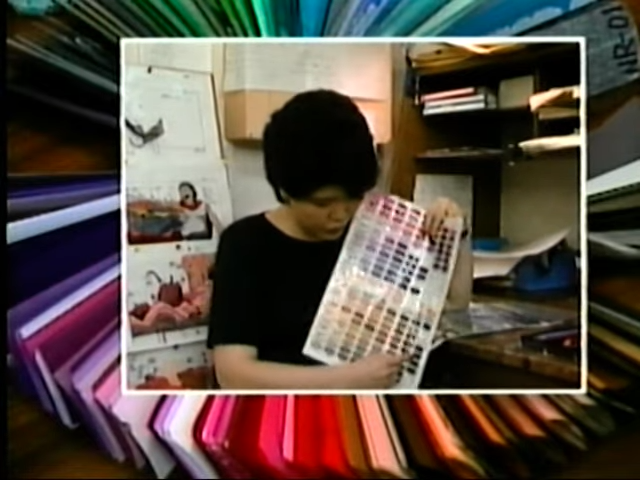
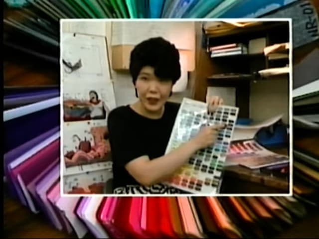
Fifty colors! Invented! An incredulous claim, but here’s a clip from a contemporaneous behind-the-scenes VHS documentary of Akria explaining the situation with the invented colors.
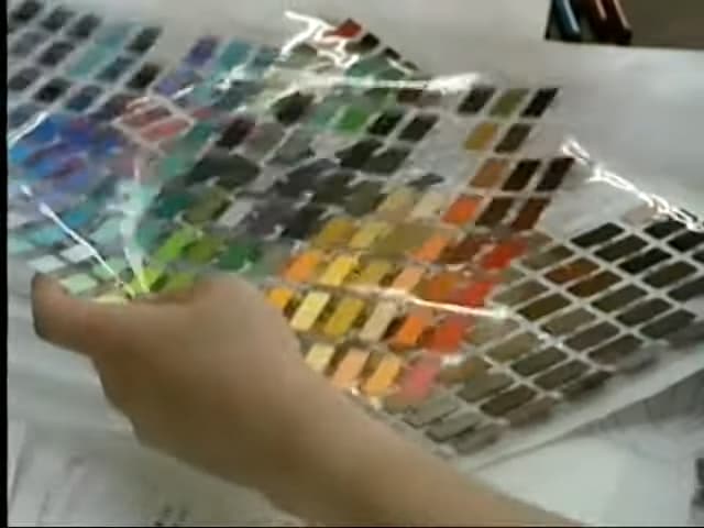
To accommodate the dark themes of the film and the five-stage variations of character shading, they added 50 shades of color to the commonly-used animation color palette. You can see the physical color palette in a couple places in the clip.


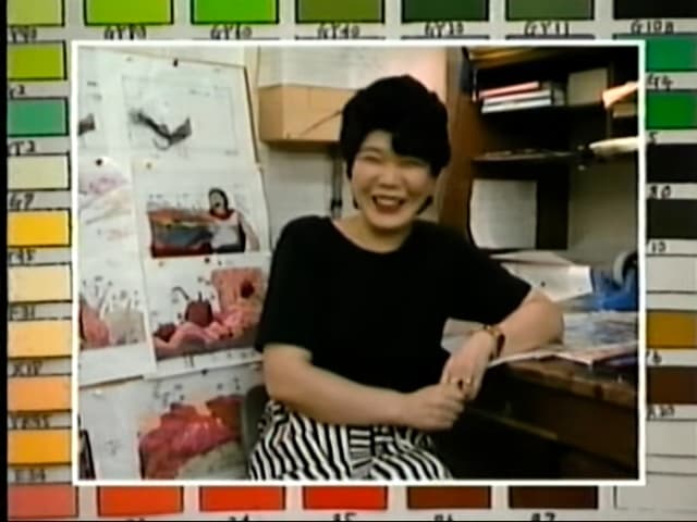
Kimie Yamana adding more… ahem… color… to the topic.
If you look at the color chart you’ll see the tremendous variety of dark tones. Many colors you wouldn’t see in other animation. There’s such subtlety in the various tones, you wouldn’t notice them on a television screen. But in the theater the large variety of colors really makes a difference.
— Kimie Yamana, Color Coordinator
Adding more, almost imperceptible, tones to the color palette allowed the neon-noir setting of a cyberpunk Neo Tokyo to thrive. Light plays a major role in the film and the use of color allowed the city itself to come alive as a character. A shadowy city that has light, life, and explosions.
Impressive. If you watch the whole behind the scenes video, you get a sense of the massive undertaking that was Akira. Blockbuster budgets and all the big name studios pitching in to make something bigger than themselves. Something timeless. Something breathtaking.