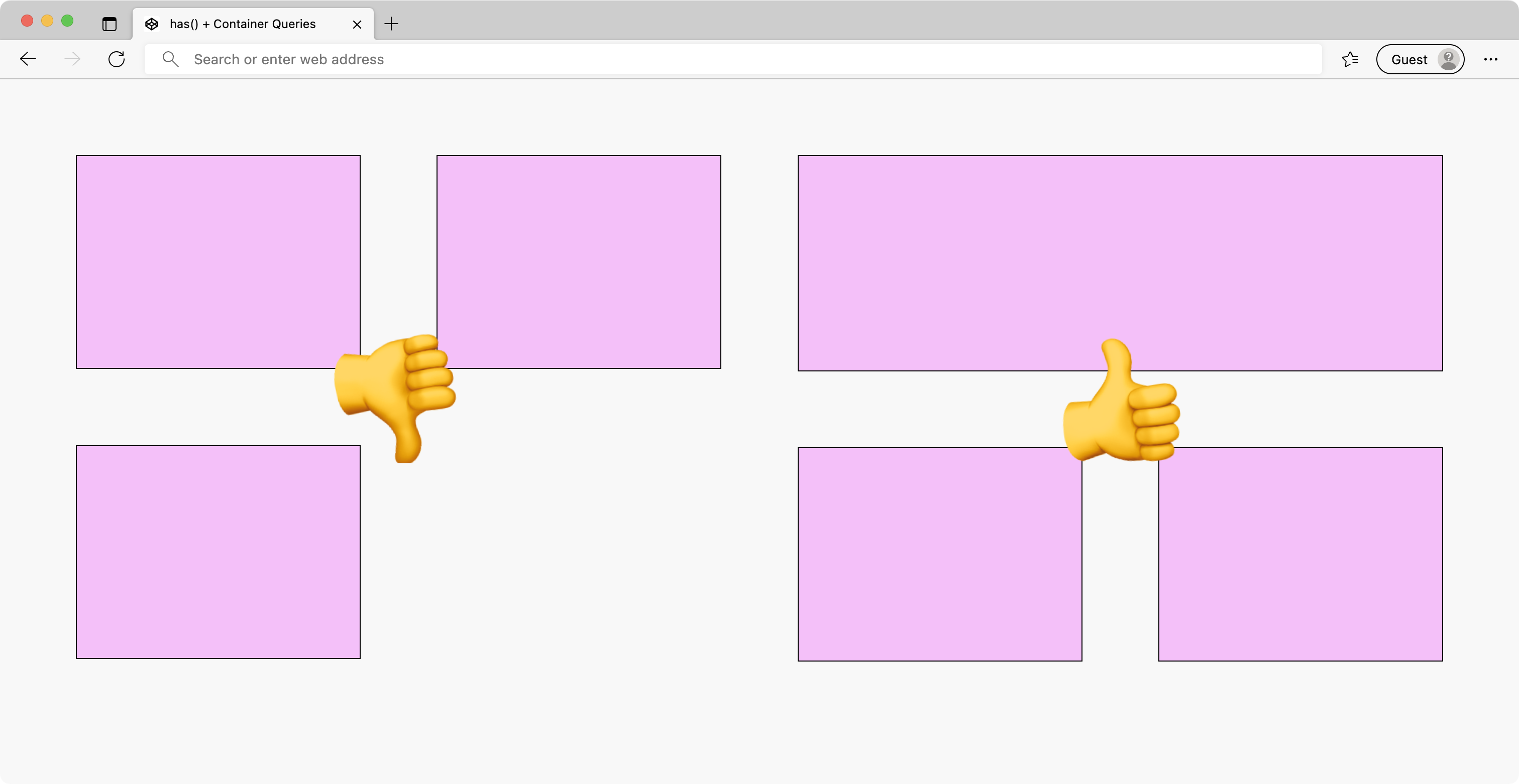
Y’know that situation where you tell the client, “Here’s your website and you can edit those four (4) little homepage features in the CMS” and the client says “Okay okay okay” and you check the site a week later and it looks bad because the client —despite your incredible documentation— put an odd number of items in the feature grid? It’s a major minor problem that’s tough to explain to the client, but it all comes down to…
The dangler.
Odd number grids are a sore point in Responsive Design. Even numbered grids collapse easily from 4 columns → 2 columns → 1 column, but odd numbered grids leave you with one extra column to figure out. You have two choices: drop the odd column to its own row or take the coward’s route and convert 3 columns → 1 column prematurely at ~800px. If you take that route, two more choices appear: awkwardly center the content or awkwardly stretch all the items out. This is how painful-looking tablet views are born.
You can design your way out of the dangler conundrum. What if we could detect odd numbered columns and make the first item full-width? And then, what if we could give it a horizontal treatment when there’s extra space?
Using :has() to find odd-numbered grids 🪄
Jeffrey Zeldman, Eric Meyer, Chris Coyier, and I were talking on Shoptalk about how the new CSS feature :has() potentially changes how we do CSS. “Contextual Web Design”, I called it. We drummed up some examples but I’ll confess I’m still wrapping my head around what :has() can do. Jim Nielsen came up with some ideas for :has() and that got the gears turning in my brain.
The algorithm I’m going after is pretty simple: If the grid of items has an odd number of items, then make the first item full-width. But CSS can’t do logic… right? Well… hold my proverbial beer.
.items {
	display: grid;
	grid-template-columns: repeat(auto-fit, minmax(200px, 1fr));
	gap: 5vw;
}

@media (max-width: 800px) {
	.items {
    grid-template-columns: 1fr 1fr;
  }

	.items:has(.item:last-of-type:nth-of-type(odd)) .item:first-of-type {
		grid-column: 1 / -1;
	}
}
There’s two bits of magic going on. I’m using auto-fit instead of auto-fill on the grid to make sure our grid doesn’t create any ghost columns 👻. And then the most essential bit of code is the :has() selector statement.
.items:has(.item:last-of-type:nth-of-type(odd)) .item:first-of-type {
	grid-column: 1 / -1;
}
The result almost reads as plain English. This will select item grids where the last item is odd (read: it’s an odd-numbered grid) and then set the first item to span the full-width from column 1 (the start) to column -1 (the end). 🎉 Tada! Magic.
Using Container Queries to flex differently
Now that we can make an item go full-width, we don’t want to create a “top dangler” problem, that would be even worse than a “bottom dangler”. Ideally, we can apply a different treatment to give this element a horizontal treatment when its container is wide.
This sounds like a job for Container Queries! If the item container is >400px (the image size), then make the item’s inner contents display as a horizontal row.
.item {
  container-name: item;
  container-type: inline-size;
}

@container item (min-width: 400px) {
  .item_inner {
    display: flex;
    flex-direction: row;
    align-items: center;
  }
}
And there you go! A card-like item that changes its presentation based on its width, independent of the viewport and contextual to its parent container1.
Putting it all together
On their own each of these tricks is great. But together, they create something special: a content machine that applies styles conditionally based on quantity and size of the content inside. I made a demo of this in CodePen so you can give it a squeeze.
⚠️ As of July 2022, this only works in Safari Technical Preview and Edge/Chrome Canary.
Container Queries are a real gift here. In fact, Container Queries solved a problem I hadn’t even considered… what if the client entered two (2) items in the CMS and then someone visits on desktop. Thankfully our auto-fit grid + Container Queries handle that edge case without breaking a sweat, filling the space in the least awkward manner possible. Best of all, this technique progressively enhances, so older browsers get the old dangler experience.
Making the first item full-width is an old RWD trick; it’s worth noting you can do this with some JavaScript, or some class soup, or something like <div class="items" data-count="3"> on your item grid. That’s fine, but I think you’ll feel the pain of coupling and cramming a lot of logic in your item grid component. Even though I’m good at CSS, I tend to avoid styling the first child like this because of the layout complexity it introduces…
But now… now the complexity is almost gone thanks to :has() and Container Queries. What a gift. We truly are entering a new era for CSS, an era where your content informs your layout, not the other way around.
-
Note: I had to use an extra
div.item_innerto make this work how I wanted it, but you’re clever and may find a better way. ↩