One principle I’ve come to embrace is that the answer is rarely ever a spectrum. At first glance, a single-axis spectrum might make perfect sense, a reduction of the problem, a right and a left, a binary dichotomy but with a grey area in the middle. But as I grow older a spectrum falls short for me in a couple different dimensions.
Take color for instance. As kids we learned about the ROYGBIV visible spectrum of light, the zone between infrared light and ultraviolet light that most of us humans can see.
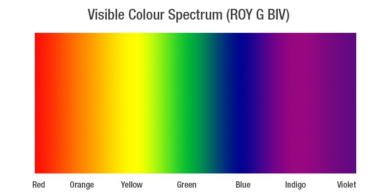
The rainbow, a naturally occurring ubiquitous concept. Children love rainbows. A light spectrum makes for a great science experiment or album cover. All the hues of visible light rolled into one gradient stripe.
In design tools the different hues are often represented in a 360º color wheel, an infinitely wrapping spectrum of rainbow colors.
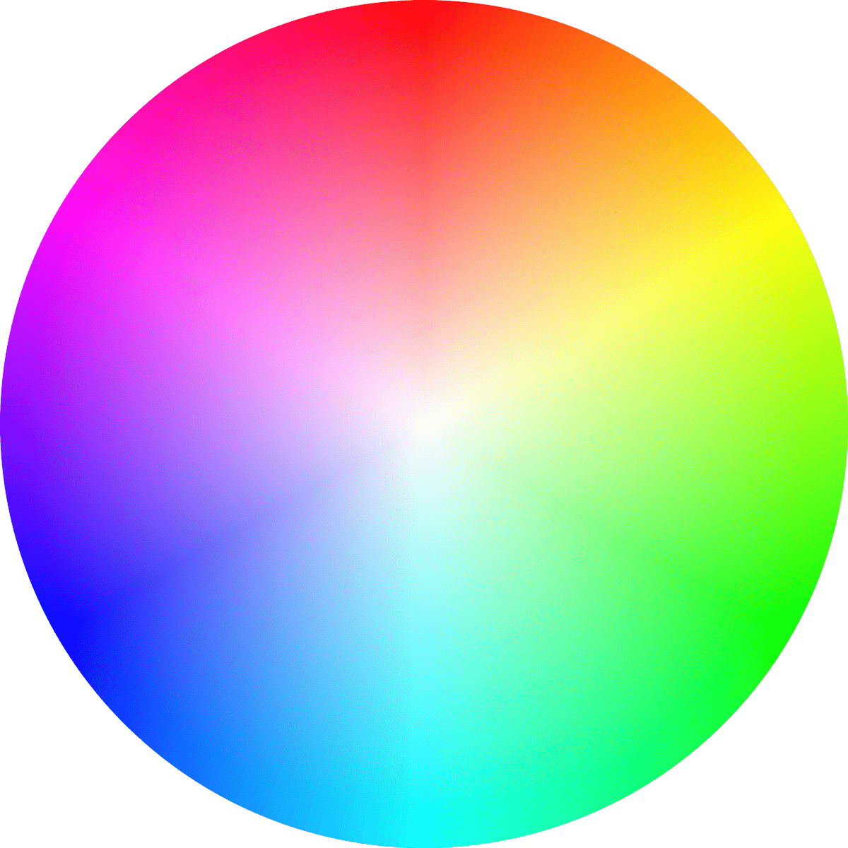
A beautiful rainbow circle, I hope my computer is okay.
Then… we learn about saturation. Colors can be vibrant and saturated or duller and unsaturated shades. You can tune color wheels to provide this effect, but for the best representation of color saturation, we need another axis as if color exists on an XY chart.
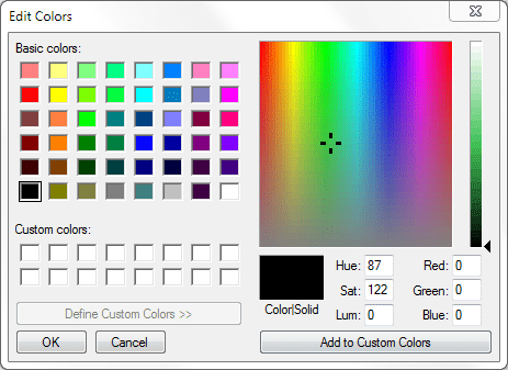
Thus color pickers! The horizontal X-axis reflects the hue across the ROYGBIV spectrum and the vertical Y-axis reflects the saturation. Adding another dimension helps explain color and saturation in a single image. Two axes are better than one.
But look! On this particular color picker there’s a slider to control another aspect of color: lightness, a way to tint a color lighter and darker. This hints that our XY plot isn’t enough.
This is where math and algorithmic representations of colors and lightwaves start coming into play. On the web, we can express over 16 million colors using a mix of red, green and blue pixels or expressing a color in an alternate method of combining hue, saturation and lightness; each three properties, three dimensions of differentiation. We actually need three axes to visualize our color possibilities which we can do in a three dimensional space.
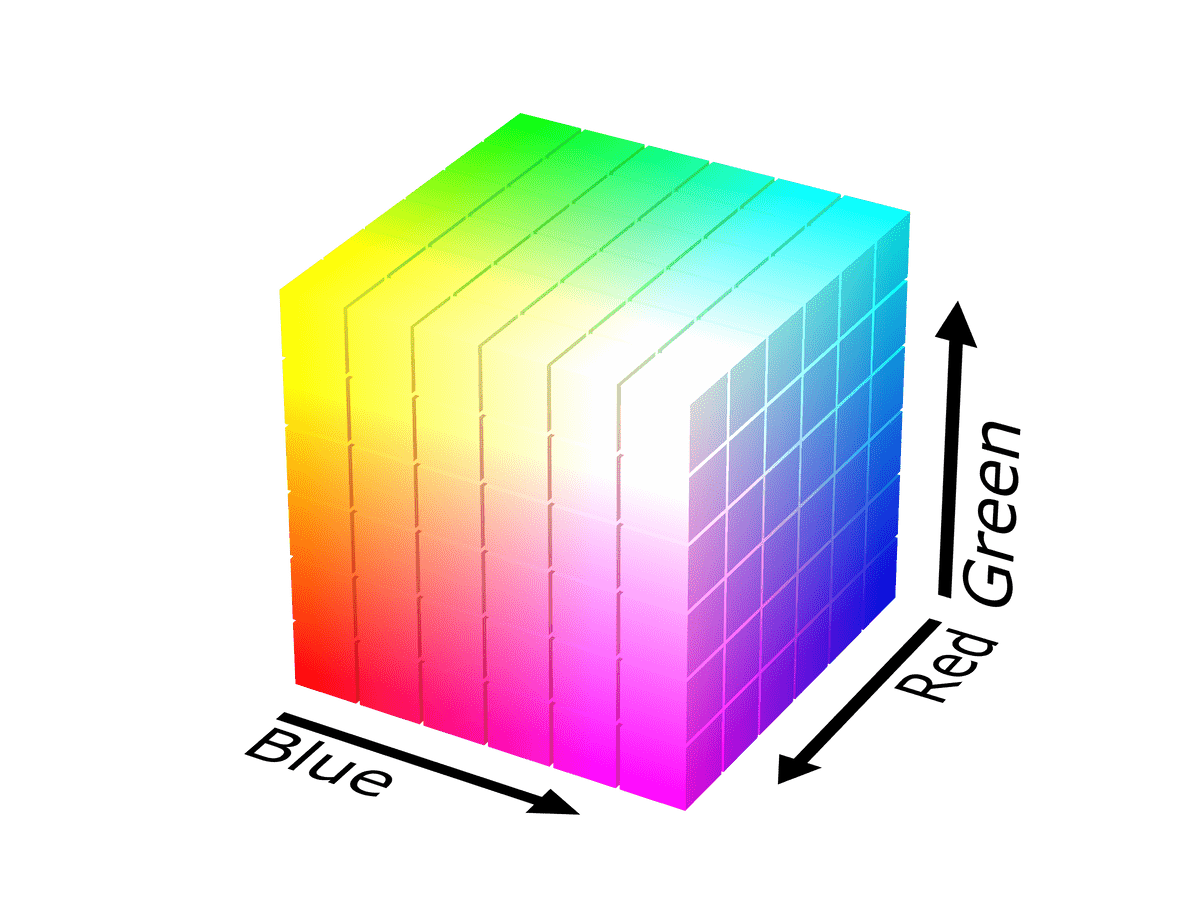
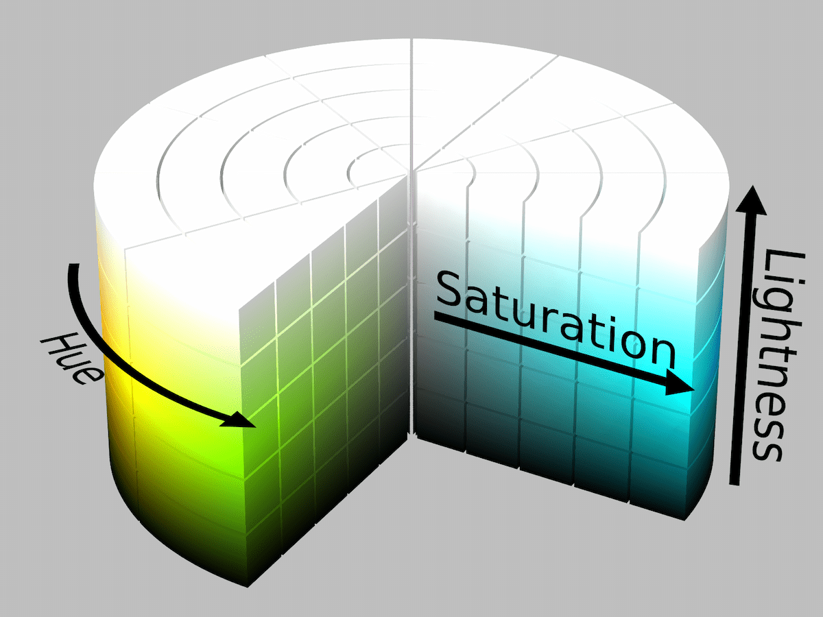
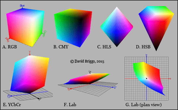
The RGB color space looks like a gay Rubik’s cube and the HSL color space looks like a birthday cake drenched in icing. Each color-space (RGB, HSL, CMYK, Lab, etc) has its own different space of representable colors! The algorithm for each color-space gives us a different perspective. David Briggs has a collection of renderings of color spaces next to each other.
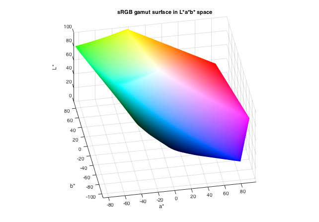
The shape of the color space is somewhat dependent on the math and algorithmic shorthand used by the color profile to derive the colors. Steve Eddins generated a beautiful rendering of a rotation of the Lab color-space and it’s one of my favorite renderings I’ve come across.
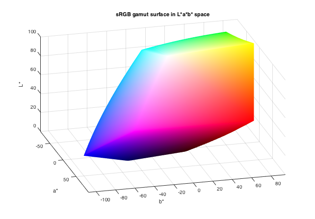
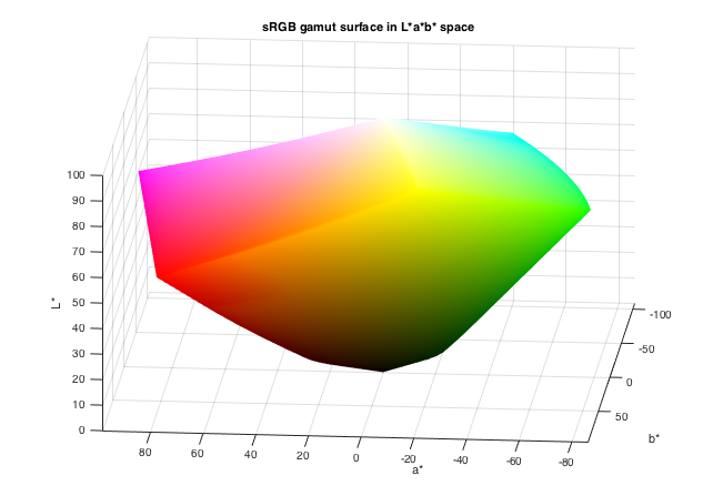
There’s more color spaces to explore! I found an old app for Windows called Gamutvision that tries to visualize these color spaces. John Austin explains the mathematical history of color spaces. Craig Hockenberry —who wrote a book on color— wrote about Apple’s new wide-gamut displays and links to an even more in-depth look at color gamuts on Mac. There’s newer and wider gamuts on the horizon too, colors we’ve never seen on the screen before!
People see color differently. Not just that they bought a nice TV or phone with a wider-gamut and more accurate algorithm, but also due to a variety of cultural or physiological differences as well.
In Japan they call the color of their verdant bamboo mountains, leafy green vegetables, green apples, and the color of the “go” signal on a traffic light; 青 (blue). I learned the history of this in college, but it always caught me by surprise an entire nation could be so collectively wrong… or was I the one who was wrong in that particular cultural setting?
Personal perspective factors in too, even factoring out colorblindness. My wife calls the international walk signal pictogram “the blue walking man” and while it does have a blue-ish tint, I guffaw because it’s clearly white. And don’t get me started about the color of a tennis ball; she insists it’s “fluorescent green” and I recognize it as the color “fluorescent yellow” —as in “optic yellow”, the literal color name for a tennis ball— but it’s hard to say who’s right. We’re not alone in our disagreement and the Wikipedia page for tennis ball is now locked after hundreds of edit wars over dozens of years.
So that’s color. It can be a spectrum and you wouldn’t be wrong, but the possibilities of color are more accurately modeled in a multi-dimensional space. I’m not anti-spectrum, they’re an improvement over binaries, but they rarely sum up the entire issue at hand. Factor in your culture’s understanding of color or your personal understanding of color via the rods and cones in your eyeballs… color is both extremely objective and extremely subjective. And on a computer, the hardware algorithm that is showing you the colors might also limit your perception of color.
Anyways, those are my thoughts on spectrums. I feel you can apply multi-dimensional thinking to a lot of ideas: good vs. evil, gender, politics, disabilities, technology choices, kanbans, video game character balance, and the list goes on. Your mileage may vary, but I think there’s one thing we can all agree on; most dichotomies are false. 😉