Last week I got the opportunity to work on a side project that has no plans to include IE11 in the support matrix and let me tell you; what a wonderful feeling! This opens the door to a lot of fun CSS, namely Custom Properties. Adding a proper “Dark Theme” to the application has been on the backlog for awhile and seeing some free time in my schedule, I sat down to hammer it out. It’s nothing super original, but I settled on a solution where I can layer in the ability to theme my application but also maintain some of the power of Sass in the process.

The existing project used Sass for partials, nesting, variables, and maps and for-loops for generating some utility classes. The color variables are setup like this:
// Sass Vars
$black:      #1f1f1f;
$grey:       #656565;
$light-grey: #f2f2f2;
$white:      #ffffff;
$primary:    #e95a26;
Converting that to CSS Custom Properties was fairly straightforward:
// Custom Properties
html {
  --black:      #{$black};
  --grey:       #{$grey};
  --light-grey: #{$light-grey};
  --white:      #{$white};
  --primary:    #{$primary};
}
Using Sass variables here is almost redundant, but I’m glad I didn’t delete them. Digging in the code, I found dozens of places where we were using Sass color functions like lighten() and darken(). Programmatically generating colors (grays) still has a ton of value for this project. Unfortunately, CSS doesn’t have color functions (yet). Rather than letting this be a blocker for me, I decided I can have the best of both worlds.
--border: #{darken($light-grey, 6%)};
After crafting variables for my default light theme, I started crafting a dark mode. We ended up using a JavaScript toggle in the UI for this, but for the first pass, I started with a prefers-color-scheme media query and used Dev Tools’ Rendering panel to toggle it.
@media (prefers-color-scheme: dark) {
  html {
    --black: #{$white}; // BIG NOPE
    --white: #{$black}; // BIGGER NOPE
  }
}
Ugh. Let’s stop. This isn’t great. Breaking the meaning of words is a sign of a poor theming strategy and I will lose my grasp on reality. Knowing this is a bad path, it makes sense to introduce a level of abstraction above my CSS variables with semantic names that work in both light and dark situations.
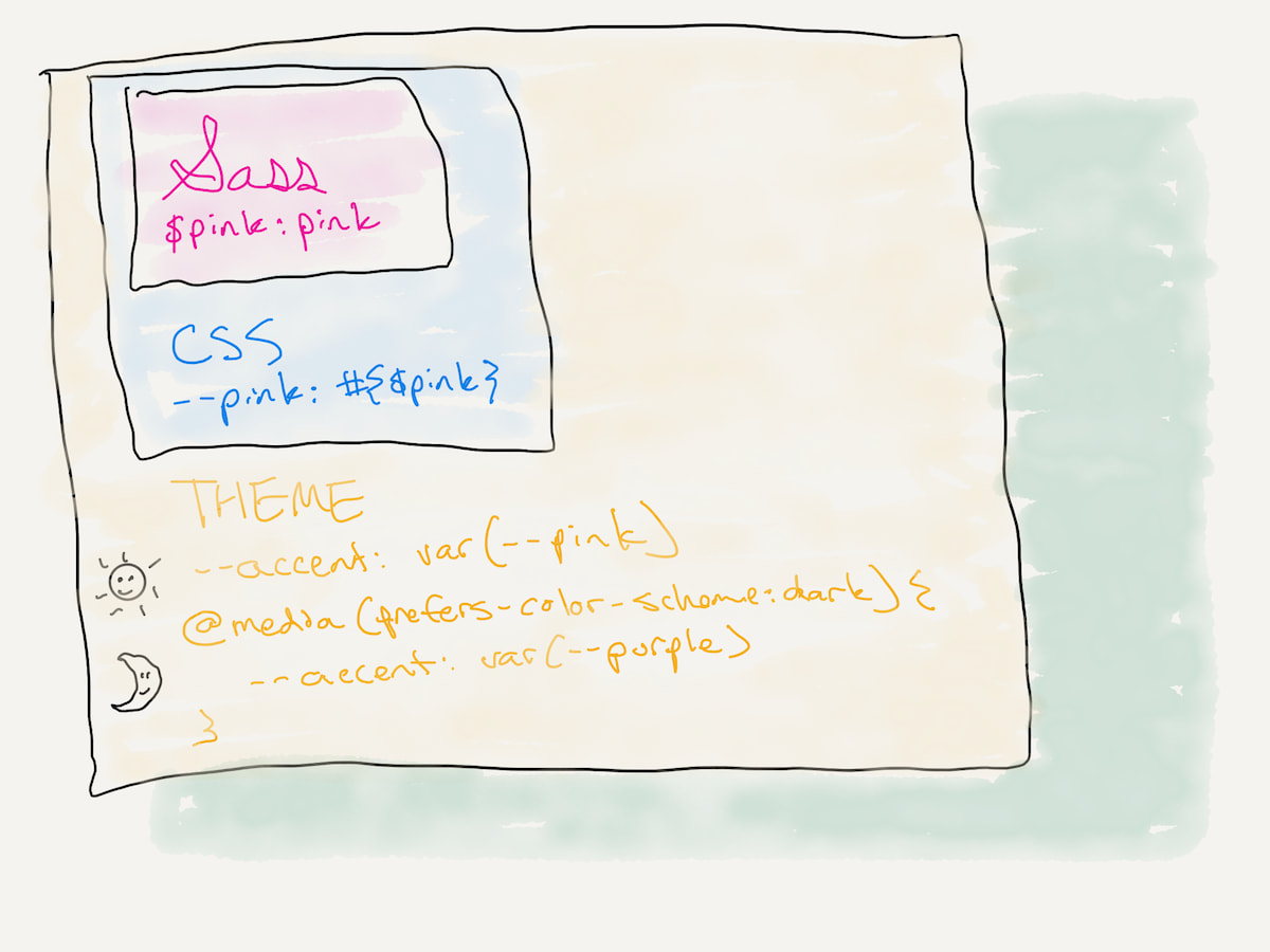
The end result looks something like this when Sass, CSS, and theme variables are all combined:
html {
  // Theme Vars
  --heavy-text: var(--black);
  --faint-text: var(--grey);
  --bg-alt:     var(--light-grey);
  --bg:         var(--white);
  --border:     #{darken($light-grey, 6%)};

  @media (prefers-color-scheme: dark) {
    --heavy-text: var(--white);
    --faint-text: var(--light-grey);
    --bg-alt:     #{lighten($black, 6%)};
    --bg:         var(--black);
    --border:     #{darken($grey, 6%)};
  }
}
Sometimes I want to apply the opposite color in dark mode. Other times I want to find something totally different, this is where having access to those color functions helps a ton. I can maintain a core color palette but adapt as necessary.
The rest of the work was combing through the application and doing a global find-and-replace. $black became var(--heavy-text), $white became var(--bg), and so on. Within a couple hours, my light themed application now supported dark-mode. From a backwards compatibility perspective, all the Sass variables still work. If there’s existing work lingering in a branch or some hard-coded Sass variable I missed in the migration, nothing breaks in the default light theme. This layered variable approach has some built-in tolerance where we still maintain the power of existing tools, but reduce our dependency on them a bit without blowing up the whole application in the process.
Key takeaways
Some brief takeaways from this short exercise of adding theming to an existing app in a couple hours:
- I’m glad we started with literal variable names in Sass. I know using semantic variable names like
$brand-primaryare in trend, and I’ve advocated for them before, but it helped that we didn’t have that abstraction until we needed it at the theming layer. - Constraining customizability is hard work. Try to add enough, but don’t go overboard. For every variable you expose now, you have that many problems times that many configurable contexts later.
- We’re getting good mileage out of our half-dozen variables. It may grow but not much. I think the key is setting constraints on how many flavors of gray you’re gonna allow.
- The nice thing about using CSS variables for all this is you can override things at the component level. If
--bg-altisn’t the correct color in both themes, or you need some special unspecified color for the Singaporean New Year, or--bg-altis on top of--bg-alt… you can override it. Variables defined, loosely held. The cascade wins.
The biggest takeaway for me is that I’m not done with Sass quite yet. I like Sass. I get great value out of it, but one less build tool would make my day. When/if CSS gets color functions I think we’ll be that much closer to that Sass-free utopia.