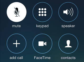
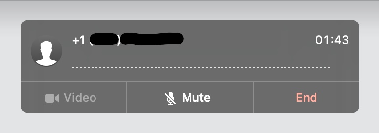
Because I’m a remote worker, voice chat apps are an issue near and dear to my heart. Having sat through a lifetime of technical difficulties, I can say without a doubt that the most important piece of UI in any voice chat app is the Mute Button.
Here’s a running list of voice chat clients I have used for work (this week)…
| App | Active Mic | Muted Mic |
|---|---|---|
| iOS Phone | 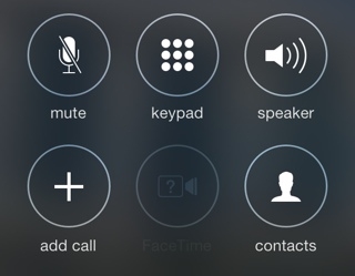 |
 |
| Facetime for Mac | 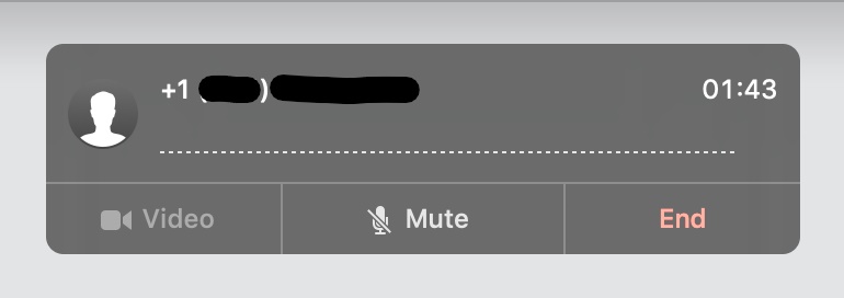 |
 |
| Slack |  |
 |
| Slack for iOS | 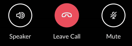 |
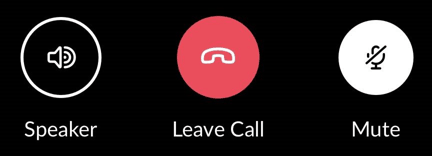 |
| Skype (for Business) |  |
 |
| Google Meet |  |
 |
| Microsoft Teams |  |
 |
| Zoom |  |
 |
| Discord |  |
 |
| Webex |  |
 |
| GoToMeeting |  |
 |
I hope you, dear reader, know by now that it’s a best practice to mute yourself if you’re not talking. Normally I’d say non-muters deserve public shaming but looking at this chart, it’s maybe not the non-muters’ fault. As you can see, the active mic indicator varies wildly. Sometimes it’s a microphone with a background fill, sometimes it’s a microphone with a slash, sometimes muted is treated as a background fill with a slash, sometimes the icon fills up with green when talking. It’s all even more confusing if someone is sharing out their screen and your entire UI disappears.
UI is hard.
For me, the best practices that stand out are:
- Mute indicator visually connected to avatar or username
- Highlight or indicator when speaking
- Offer push to talk
I’d honestly prefer Push to Talk across the board. In fact, my coworkers Julian, Joel, and I believe this so much we’ve got plans to quit web work to form a hardware startup that creates remote work-centric devices, our first product will be Talkie: a microphone with a physical push to talk button. Our second product will be Walkie Talkie: an on-the-go mobile microphone speaker combo with a physical push to talk button.
Support us on Kickstarter.