As a Front-End developer nothing bothers me more than seeing an unexpected horizontal scrollbar on a website. While building out a checkout layout with CSS Grid I was surprised to find something mysterious was breaking the container. I thought Grid sort of auto-solved sizing.
Eventually I found two ways to break CSS Grid. As it would happen, I was doing both in the same layout. 🤦
#1: Overflow-x Elements break the Grid
We had a subnavigation pattern in our checkout that would overflow-x to reveal more payment options. Even with overflow-x: auto applied the Grid Item was being sized to the scrollWidth of the subnavigation. Turns out any overflow-x element like a <code> block or a responsive table solution would break the Grid. Here’s a reduced test case:
See the Pen Overflow-x Elements Inside CSS Grid (bug? behavior?) by Dave Rupert (@davatron5000) on CodePen.
Typically overflow-x: auto fixes horizontally overflowing elements. But nope, not here. The next escalation is to wrap the element and try a bunch of overflow: hidden tricks to force the layout to obey. Still nope.
The reason this is happening is that Grid Items have a default min-width: auto and will auto-size to the content inside. It sets its min-width based on the width of overflowing block. So to fix an deeply nested overflowing child, you counter-intuitively ignore the parent element and go all the way up the DOM tree to the Grid Item and zero-out the min-width.
.grid > * { min-width: 0; }
This will result in Grid Items with overflowing content to be sized correctly. But not always…
#2: Form Controls break the Grid
Our layout was also using Grid to put form inputs side-by-side. I created a reduced test case of different input types in a CodePen to isolate the problem. If you squeeze the window until you get a horizontal scrollbar ~380px you’ll see inputs spilling out of the grid track.
See the Pen CSS Grid PRBLMZ 😢😓😭 by Dave Rupert (@davatron5000) on CodePen.
Typically to fix inputs like this you’d apply max-width: 100%, but while that mostly fixes Chrome and Safari some elements and elements in Firefox and Edge still break out of the grid track.
Why is this happening? Because <input> elements and their ilk (<img>, <progress>, <select>, <video>) have the potential of being something called Replaced Elements.
What the heck are Replaced Elements?
According to MDN, a replaced element is an element whose representation is outside the scope of CSS. These are situations where the browser takes your markup and injects a “Shadow DOM-esque” element. <video> is a great example of this, but lots of form controls also fall under this umbrella.
Replaced Elements exist in somewhat of a specification no man’s land. The styling and rendering rules around them aren’t clearly defined, just that they “often have intrinsic dimensions”. This results in browsers coming to different conclusions for the default appearance of certain elements or whether Replaced Elements are used at all. You can see in this screenshot how browsers use Replaced Elements differently and their varying sizes.
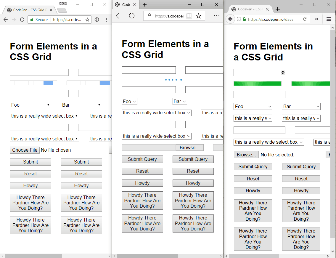
For our situation, some input elements have a phantom “intrinsic size” applied by the browser. It doesn’t show up as a browser-defined style in the Styles tab nor the Calculated Styles tab, but is a min-width of around ~180px for a standard <input type="text">.
In order to fix elements spilling out of the grid track in a cross-browser way, we have to override this intrinsic sizing of replaced elements.
/* Apply max-width to Replaced Elements and Form controls */
img, video, audio, canvas, input,
select, button, progress { max-width: 100%; }

/* Make file and submit inputs text-wrap */
input[type="file"],
input[type="submit"] { white-space: pre-wrap; }

/* Fix Progress and Range Inputs */
progress,
input[type="range"] { width: 100%; }

/* Fix Number Inputs in Firefox */
@supports (--moz-appearance: none) {
  input[type="number"] { width: 100%; }
}
There’s a side effect here where progress, range, and number now will always occupy 100% of the grid track. This could be overriden or customized.
Are these Grid implementation bugs? Not exactly.
This behavior –as someone on StackOverflow pointed out– is actually to-spec. Grid is inheriting Flexbox’s behavior around min-width: auto and Replaced Elements have min-width in their intrinsic dimensions. So it’s not a bug per se.
However, for nearly every one of my layouts, this will result in me using a utility class I’ll apply to mis-behaving Grid Items. In the interest of staying on-brand, I’m calling it “Fit Grid”.
/*
 _______  ___   _______    _______  ______    ___   ______
|       ||   | |       |  |       ||    _ |  |   | |      |
|    ___||   | |_     _|  |    ___||   | ||  |   | |  _    |
|   |___ |   |   |   |    |   | __ |   |_||_ |   | | | |   |
|    ___||   |   |   |    |   ||  ||    __  ||   | | |_|   |
|   |    |   |   |   |    |   |_| ||   |  | ||   | |       |
|___|    |___|   |___|    |_______||___|  |_||___| |______|
by Dave Rupert
Read More: https://daverupert.com/2017/09/breaking-the-grid/
*/

/*
 * Remove `min-width: auto` from Grid Items
 * Fixes overflow-x items.
 */
.fit-grid > * { min-width: 0; }

/* Apply max-width to Replaced Elements and Form controls */
.fit-grid img,
.fit-grid video,
.fit-grid audio,
.fit-grid canvas,
.fit-grid input,
.fit-grid select,
.fit-grid button,
.fit-grid progress { max-width: 100%; }

/* Make file and submit inputs text-wrap */
.fit-grid input[type="file"],
.fit-grid input[type="submit"] { white-space: pre-wrap; }

/* Fix Progress and Range Inputs */
.fit-grid progress,
.fit-grid input[type="range"] { width: 100%; }

/* Fix Number Inputs in Firefox */
@supports (--moz-appearance: none) {
  .fit-grid input[type="number"] { width: 100%; }
}
Heavy-lifting layout grids need to be agnostic of the content inside of them and tolerant to support a wide variety of scenarios. I’ll likely need to include this on every project to make Grid Items as tolerant as possible. While not a bug, I can see this as being “Clearfix 2.0” territory.
If it were up to me, I think Replaced Elements should always obey and fit inside the Grid Track. I’d love it if browsers could come together on this. The only other question I have is whether or not all Form Controls should occupy the entire grid track like progress, range, and number require. The solution is input, select { width: 100% }, but my gut is telling me not everyone would want that.
If you have improvements, I’d love to hear it them and I’ll put this up on GitHub, but please test it in every browser before claiming a fix. Thanks, d00dz.
Thanks to Greg Whitworth from Microsoft Edge for helping me debug and understanding Replaced Elements a lot more.