This year at CES 4K televisions were a big deal. 4K UltraHD displays for computers have been available for awhile, there’s even one on Apple’s website, but at $3,500 they’ve been cost prohibitive. That all changes with the announcement of new 4K displays priced at less than $1000.
Affordable 4K
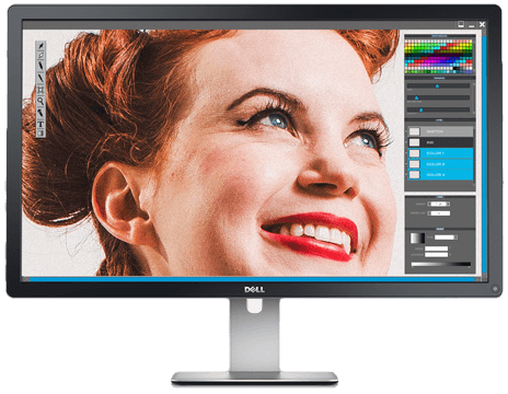
Meet the Dell 28 UltraHD monitor, a $699 28" 4K desktop display. It’s poised to be one of the most cost effective 4K displays on the market. Lenovo1 and Asus have both announced 28" displays for $799. A recent post by Brian Hauer lauded that 4K is a dreamland for programmers. It sounds great, but for me low-cost, high-fidelity displays add two new dimensions of complexity to our already over-complicated image asset spectrum:
- Ultra Big: 3840×2160 resolutions
- Big and Dense: 1920×1080@2× resolutions
Prior to last week, I would have regarded a 2000px wide PSD as more than sufficient for any website. Now it seems that it wouldn’t even begin cover either of these two new use cases.
Even Mo’ Pixels, Even Mo’ Problems
I typically regard “What do we do about large screens?” as an extremely first world problem. It’s a top 1% of the top 1% globally sort of issue. Based on data trends, we should all be thinking mobile first, considering desktop as a bonus. Mobile is king. With that in mind, let’s examine yet another curio in our glass menagerie of web-enabled devices.
4K displays really reaffirm the need for a responsive images solution. If you choose to support 3840×2160 or 1920×1080@2× with full bleed imagery, it would require a 10 megapixel image. As it happens, you can’t even send a 10 megapixel image to all devices because iOS will simply will not accept them. Womp womp. Fingers crossed, however, there’s some good momentum in the RICG.
So rather than succomb to fear, uncertainty, and doubt; I try to find a some simple guidelines to keep myself afloat. I re-evaluated the guidelines from my 2012 “Mo’ Pixels, Mo’ Problems” article for A List Apart and I believe that they still hold some sound advice and bear repeating:
- Use CSS and web type whenever possible
- Use SVG and icon fonts whenever applicable
- Picturefill raster graphics
Above all, 4K underlines that our designs must strive to be as resolution independent as possible, driven by a CSS and vector-based mindset.
What about Apple?
Because of Apple’s incredible influence in the web design community, we must make mention of them. If I were announcing a brand new version of the long-in-the-tooth Thunderbolt Display, our industry would be in a hysterical tailspin about it all. Putting on my tech pundit hat, I think it’s fair to expect Apple to announce similar, but more expensive, 4K displays at some point this year. The demand is growing.
And this I know to be true; On that day, there will be much weeping and gnashing of teeth. Bank accounts will auto-draft to the gods of Cupertino. Then the curved glass mothership shall be completed.
-
Lenovo has two displays, the ThinkVision 2840m ($799) and the ThinkVision 28 (Touchscreen + Android for $1199, squeeee!) and they look quite nice. ↩