The best talk I think I ever saw was by Scott McCloud at InCtrl Orlando 2014. Scott, a comic artist and graphic novelist, spoke about the evolution of comics as an art form and a communication medium. The talk was not web-centric at all but the parallels between Comics and Web Design are so overwhelming it raptured my attention.
During the talk, Scott showed a single slide with a single panel from an old Tintin comic, The Calculus Affair.
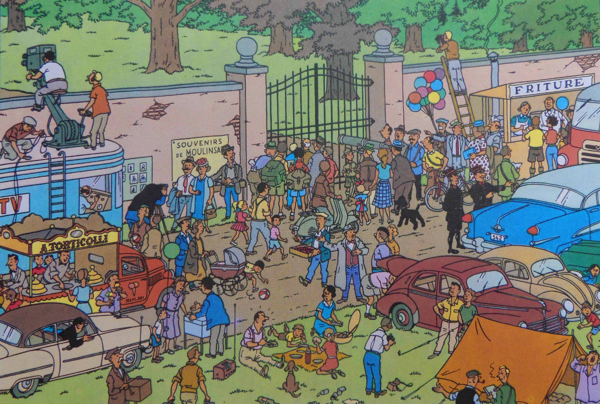
“Cognitive Overload”, Scott calmly said.
I was arrested.
Scott explained how in comics you can use information density to force a user to pause while reading. In my brain, I knew this but had never seen it illustrated so well. As I tend to do, I made the connection to webpages: there’s only so much information I can process on a screen.
During the Q&A, I leapt from my seat to ask Scott how an artist pulls off a complex panel like the one he showed without overwhelming the reader leading them to close the book. His (paraphrased) answer was simple:
“As a panel becomes more complex, you remove detail to prevent a reader from being overwhelmed.”
A simple answer never struck me so profound. As the amount of information increases, removing details reduces information density and thereby increasing comprehension. In fact, if you read Scott’s book Understanding Comics, he explains it’s not so much about removing detail, but about enhancing what’s important.
More screen… Less content?
In a responsive design, I tend to do the opposite. As the screen gets larger,
I’ll throw up more information in adjacent columns or even display:block
metadata I hid on mobile because it was inconvenient. I think a lot of sites do
this. The collective assumption seems to be more screen == more content.
But when I factor in what Scott McCloud says about cognitive overload, in the context of a responsive design, does it make more sense to strip away details as you float more columns to larger screens to reduce the cognitive load? Or maybe you never introduce the details in the first place?
The Dribbble feed is a prime example of this phenomenon. As the viewport widens, the grid expands and more shots surface in the viewport. That’s more details (username, like count, rebound count, etc) becoming visible to the user. The mental processing power to digest the feed increases. Interestingly, and possibly related to this issue of cognitive load, in the top right you can select 4 different layouts when change the size of the shots and show or hide the details. This was probably based on User Feedback (there’s been browser plugins that modify the feed since forever), but I wonder if users are subconsciously responding to the effect of cognitive load.
I don’t think there are any definitive answers, just more questions…
Is Cognitive Load Measurable?
Given a page with a white background, we could count all the pixels in the
viewport that are not #FFFFFF and abstract a ratio (or score) to correlate to
the density of information. Maybe the number of colors/fonts/images factors in?
Not scientific, but might give a baseline of user comprehension thresholds.
Here’s a rough draft attempt on measuring Cognitive Load. Take a screenshot of a
website, use <canvas> to create a high-contrasted black-and-white image, count
the number of black and white pixels, get a ratio.
See the Pen Trying to Measure Cognitive Load [WIP] by Dave Rupert (@davatron5000) on CodePen.
Somewhat related is the work of Vidhya Navalpakkam1, a Researcher at Yahoo, who wrote a paper called On Saliency, Affect, and Focused Attention (2012) which tried to answer a similar question. What effect does “Saliency” (the degree to which something stands out on a given page) have on user comprehension. The results are a bit inconclusive in the paper, but there seems to be a link between visual density and task completion.
Does the ability to measure the amount of brainpower needed to parse a webpage improve our designs? Eric Meyer in his talk Designing for Crisis speaks personally and eloquently about how user context changes when people are preoccupied with an immediate emergency. They need information but don’t have the auxiliary patience or cognitive ability to navigate your complex website. Understanding the mental computing power of your site could make lives better.
But we must be careful not to make moral judgements too quickly. CJK (Chinese-Japanese-Korean) sites tend to be more information dense to the extent that non-dense pages are considered untrustworthy. Is this cultural? Is this an exception for logographic languages? Maybe someone out there really understands CJK websites and information density.
The answer, like most things in Web Design, is probably: “It depends.” I don’t have answers, just more questions and personal biases against visual clutter. But I think the more we understand cognitive load and how to wield it, the more our users benefit.
Thanks to Alex Russell for the link to Navalpakkam’s research.
-
Navalpakkam even has a patent on Saliency-Based Evaluation of Webpage Design and Layouts. ↩