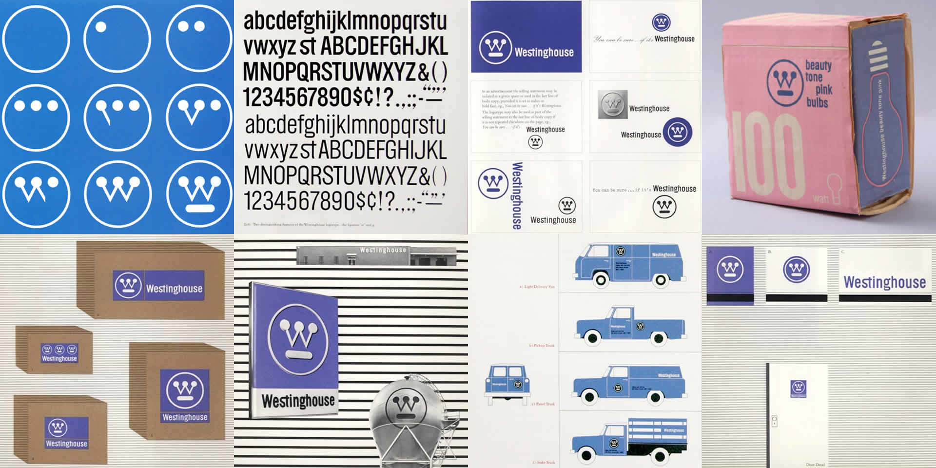
During the era of Print Design, companies would approach agencies for a brand identity system. Don Draper would then hire one of two people: either Paul Rand or Saul Bass. Paul Rand’s work with Westinghouse makes a great case study for building a design system.

The identity work started with a simple logo and color scheme and then scaled to business cards, product packaging, vehicles and more. The sum of these components made up the physical brand.
Building webpages is not so different. The old PSD-to-HTML workflow served us well for many years, but isn’t able to stand in the face of all the complexity that responsive web design and the multi-device web have introduced. Internal processes have already begun to change. Likewise, how we craft webpages and what we deliver to our clients must mature.
Modules, not pages
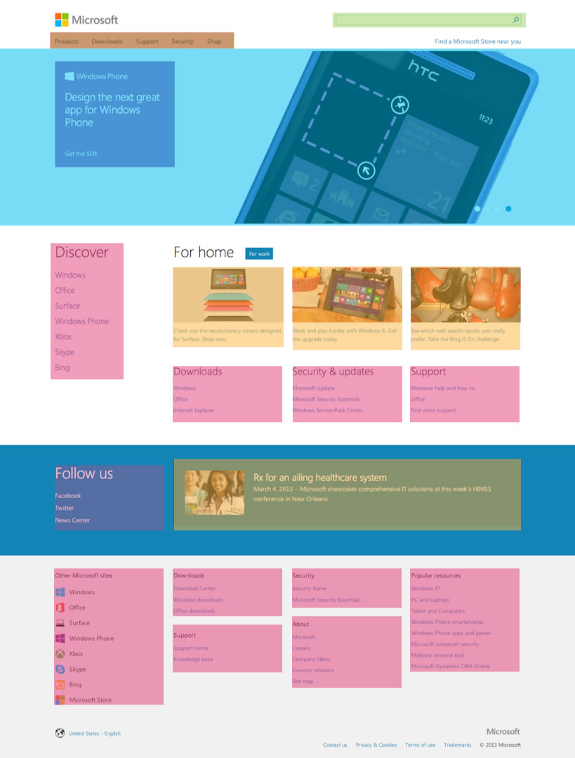
The traditional way to handle complexity in programming is to break large complex things into smaller well-formed “modules”. Focusing on creating healthy front-end modules1 instead of complete pages can help break complex page layouts into reusable solutions. This proved to be true working on the Microsoft.com homepage.

From the exterior, it may appear to be a single page but the homepage is actually comprised of Lego®-like building blocks designed to be combined together. The look and feel of new components like form controls, navigation, and carousels are informed by the colors and type that define the brand.
Good components make code reusable. Tyson Matanich, developer at Microsoft, was the main driver and lead enforcer to ensure that all components were reusable at their core, running each component though stress test scenarios. He coached us in how their components might be reused and continually pushed us to “componetize” even further.
The highlight component, for example, can be re-purposed and “themed” in the news section using a simple CSS class. While they are different visually, they possess the same underlying code structure. All these components are then strung together to create complete page layouts.
Working on isolated components made the iteration process faster as well. Faster and more reusable means that the work our agency performed resulted greater value for their company.
Modern day deliverables
What does a modern day Paul Rand need to do in order to bring a brand identity system to the web? Instead of delivering one PSD per page or worse, one PSD per responsive view, we should be thinking about deliverables as modular pieces of the larger system. Whether they’re based on strategy, components, or layout, they should all be built with extendibility in mind.
- Components
- Flexible grid
- Typography
- Navigation
- Accessible form controls
- Carousels
- Tabbed navigation
- Responsive tables
- Accordions
- Media lists
- Dropdowns
- Pagination
- Data tables
- Buttons
- Icon fonts
- Strategy
- Responsive images
- Responsive typography
- Accessibility architecture
- Legacy browser support
- i18n/l10n tolerance
- Performance budget
- Interaction/Animations
- Responsive advertising
- Layouts
- Homepage layout
- Subpage layout
- Article index layout
- Article layout
- Product index layout
- Product detail layout
- Sign up flow
- Checkout flow
All billable items should be accompanied with demo-able code. If some of these deliverables seem familiar, they should…
Tiny Bootstraps, for Every Client
Responsive deliverables should look a lot like fully-functioning Twitter Bootstrap-style systems custom tailored for your clients’ needs. These living code samples are self-documenting style guides that extend to accommodate a client’s needs as well as the needs of the ever-evolving multi-device web.
-
If you’re curious how to build efficient modularized CSS, SMACSS: Scalable and Modular Architecture for CSS by Jonathan Snook was the best book I’ve read on CSS in a long while. I consider it a must-read for anyone in our industry. ↩